

Set the look of an application with its UI profile
The UI profile says how an application looks and what its screens are built from. You set it once, and every screen, preview and run of the application follows it. That is why the Acme Shop screens all share one logo, one accent color and one menu.
Open the UI profile
Section titled “Open the UI profile”In the project drawer, open the application and select UI Profile. The designer opens with a live preview of the application on the left and the settings on the right.
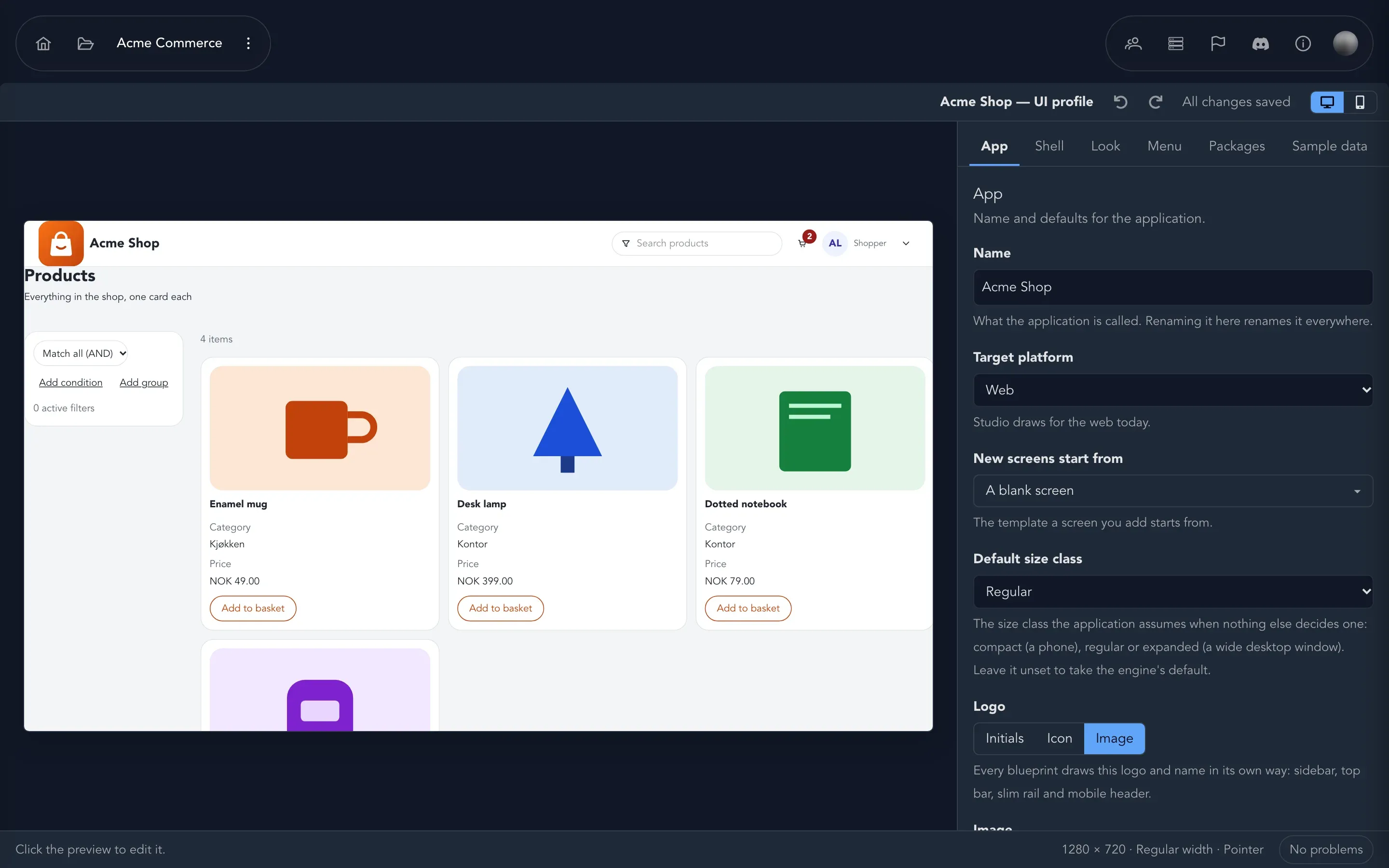
The designer saves as you go. The top bar says All changes saved, or Saving… while it works. Use Undo and Redo there; they name the step, such as “Undo accent”. Desktop and Mobile switch the size of the preview. At the bottom, the status bar tells you about the size you are looking at and counts problems.
You can also select something in the preview, such as the logo or the menu, to jump to its setting. The status bar reminds you: Click the preview to edit it.
Pick a starting point
Section titled “Pick a starting point”A new application starts with the default look. If you have not chosen anything yet, the designer offers Choose a starting point: Start from a blueprint, Use my own shell or Keep the defaults. Everything stays editable and every change can be undone.
A blueprint is a ready-made application to start from: a shell, screen templates and sample data. Adding one brings its templates into the template picker. See Screen templates.
The sections of the UI profile
Section titled “The sections of the UI profile”| Section | What you set there |
|---|---|
| App | The Name of the application, its Logo, which template New screens start from and the Default size class. |
| Shell | The frame around every screen. Change shell… swaps it for another blueprint’s shell. Create new shell… starts your own. |
| Look | The Color scheme (light or dark), the Theme, the Accent color, the Font and the Corners. |
| Menu | The Menu mode and the Menu theme. |
| Packages | Where components, styling and themes come from, in priority order. |
| Sample data | What the preview and screens show while you design. |
Name and logo
Section titled “Name and logo”The name you give the application is used everywhere. Renaming it here renames it everywhere.
For the logo, choose Initials, Icon or Image:
- Initials: one or two characters on the accent color. Empty uses the first letter of the name.
- Icon: pick one, such as Box, Layers, Home, Package or Palette.
- Image: Choose an image, a PNG, JPG, SVG or WebP of up to 400 KB. Square images work best. Replace image and Remove image change it later.
Switch Show the name next to the logo on or off. Every blueprint draws the logo and name in its own way: sidebar, top bar, slim rail or mobile header.
Color scheme, theme, accent and font
Section titled “Color scheme, theme, accent and font”Under Look, choose Light or Dark, then a Theme. A theme that needs another package says Needs that package and adds it when you select the theme. Set the Accent, the color of buttons and links; leave it empty to keep the theme’s own. Designers should look at the contrast line, for example Contrast against white: 4.6:1 (AA). Studio flags an accent that fails or is suitable for large text only. The Font applies to the whole application and shows a sample, and Corners are Sharp, Theme default or Round.
Menu mode is how the shell shows navigation: Static, Slim, Slim+, Overlay, Drawer, Reveal or Horizontal. Overlay, Drawer and Reveal respond in the preview. Menu theme colors the menu only: Light, Dark or Primary, which uses the accent. On a touch screen the menu is a drawer.
Packages
Section titled “Packages”Packages hold the components, styling and icons that screens are built from. When two packages supply the same component, the one higher in the list wins. Drag a package to change the order, or use Move … up and Move … down. Use Add a package to bring in another, and Which package supplies a component? to look up where a component comes from.
Sample data
Section titled “Sample data”Pick the Sample data pack that previews, screens and runs show. Production builds never include sample data. See Preview screens.
Fix problems
Section titled “Fix problems”The status bar counts problems. Select it to open the list: each is a Blocker, a Warning or Info, with Go to the section that needs attention and often a Fix button.
What happens next
Section titled “What happens next”- See the result on the design canvas.
- Choose a layout for each module and feature with screen templates.