

Design a screen in the screen editor
The screen editor is where a screen of a slice takes shape. You drop components onto it, such as text, product cards, a filter or a button, and connect them to what the slice knows: the fields of its command and the rows of its read models. Nothing here needs code.
Before you start
Section titled “Before you start”- A slice with a screen. The editor opens over the board and the board stays visible behind it.
- A slice that is done or under review opens Read only: its screen can be looked at but not changed.
Open the editor
Section titled “Open the editor”On the slice, select the wireframe icon, Open prototype editor. The editor opens as a window titled with the screen, the slice type and the person it is for, for example ProductBrowse · screen of State View slice · Shopper.
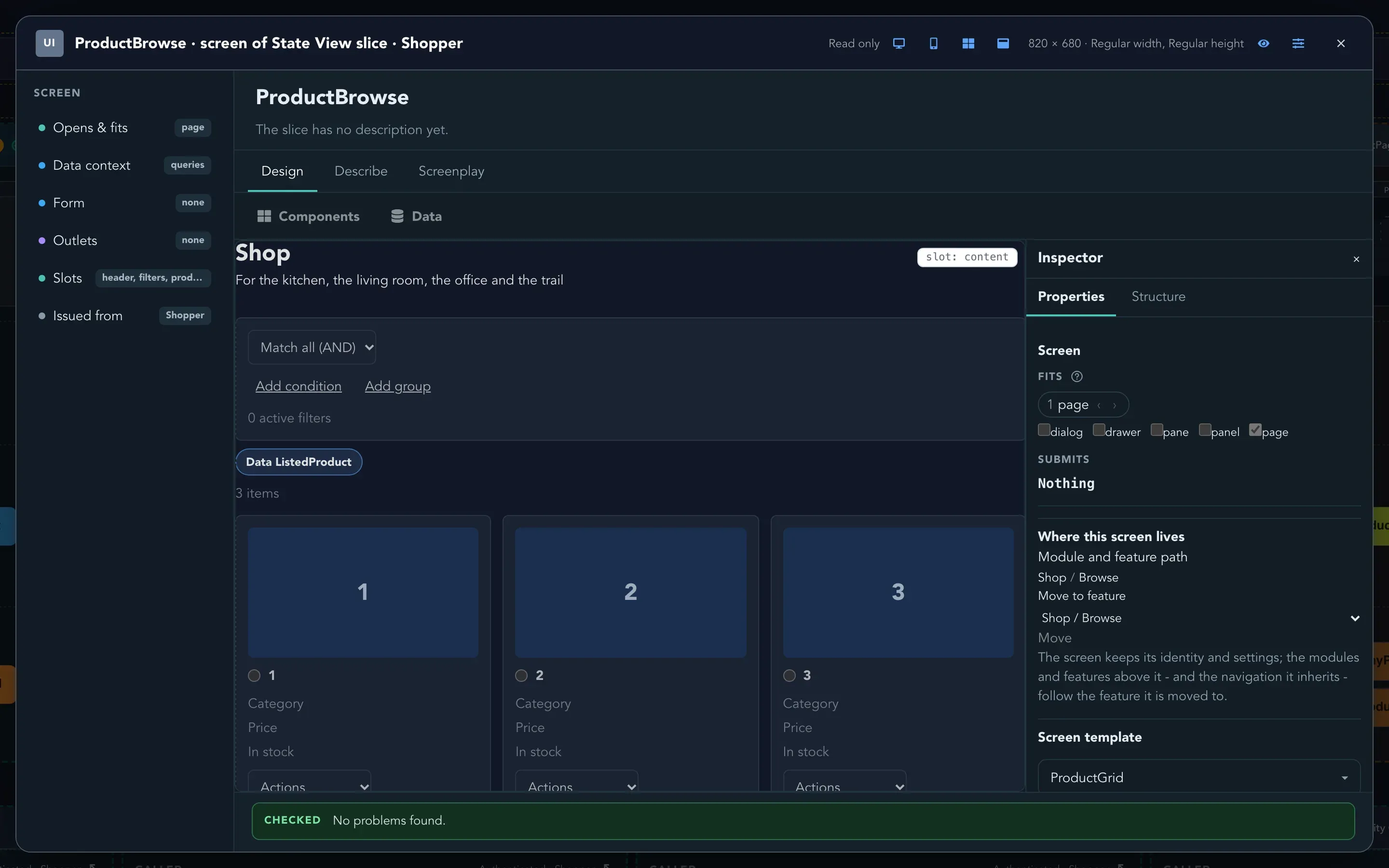
Closing the window saves the screen and returns you to the board. While you work, the window says Unsaved changes or All changes saved. Use Save, Undo and Redo in the title bar as you need them. If you close with unsaved changes, the editor asks whether to Keep editing or to Discard changes and close.
Find your way around the editor
Section titled “Find your way around the editor”| Where | What it is for |
|---|---|
| Design tab | The surface where you build the screen. |
| Describe tab | A plain-language description of the screen: where it opens, which template it uses, what data it is bound to and which slots it has. |
| Screenplay tab | The screen as it was last saved, written in Screenplay. Read it, or share it with a developer. |
| Parts of the screen (left) | Opens & fits, Data context, Form, Outlets, Slots and Issued from. Select one to see its details. |
| Inspector (right) | Properties for the selected component and Structure for the tree of the whole screen. |
Add components
Section titled “Add components”-
On the Design tab, select Components. The drawer lists the components your application offers. Type in Filter components to find one, or look under Frequently used.
-
Drag a component onto the screen. A container shows Empty - drop a component here; drop between two elements to put it between them.
-
Select the component. The Properties tab of the Inspector shows what you can set on it. Changes show on the screen straight away.
-
To change the order, drag the component, or open Structure and use Move up, Move down, Move into previous sibling and Move out of parent.
-
To remove a component, select it and use Delete selected component.
You decide how components sit together with the layout containers in the Layout drawer: Stack, Row, Grid, Container, Wrap and Canvas.
Bind the screen to data
Section titled “Bind the screen to data”Select Data to open the Data drawer. It lists what the slice can use.
- On a State Change slice, it lists the properties of the slice’s command. Drag a property onto the screen, or select it, to make a field for it. Generate the form makes a field for every property at once, and the drawer tells you when Every property is on the form.
- On any slice, it lists the queries of the feature. Drag a query onto the screen to show its rows as a table or its result as a summary. Selecting a column in the drawer shows or hides it.
- Select a component and look at Properties to choose a Query or to clear a binding.
The editor checks the screen as you go. At the bottom you see CHECKED No problems found, or what is wrong: a field that the command does not have, or a form that submits a command the application does not have.
Let a button do something
Section titled “Let a button do something”A button can open a dialog or run the command of a slice.
- Add a button from the Components drawer.
- Select it. In Properties, the button offers Open a dialog and Run a slice command. Use Choose what it opens or runs to pick the target.
When the button runs a command, the slice that owns the command shows that it is issued from this screen. See Add a screen to a slice.
Choose where the screen fits
Section titled “Choose where the screen fits”In Opens & fits, tick where the screen can appear: dialog, drawer, pane, panel or page. The order matters: when a button opens the screen, Studio picks the first place that the page has free. Each place has arrows to change the order, named for it, such as Prefer dialog earlier and Prefer dialog later. If the screen does not say where it fits, Studio assumes a dialog.
Check it on a phone
Section titled “Check it on a phone”The title bar has Desktop preview and Mobile preview. Mobile shows the screen at a phone width, where layouts can change. Two more buttons help you see the whole picture:
- Show application shell draws the menu and header of the application around the screen.
- Show the template around this content draws the template that frames the screen.
To click through the screen as a real user would, select Preview this screen with the changes not yet saved. See Preview screens.
Design a slice’s screen with an agent
Section titled “Design a slice’s screen with an agent”If your organization has an agent set up for screen design, ask it for the screen of a slice instead of building it by hand. On the board, open the add menu of the slice’s UI row and select Design with an agent. Studio opens the design canvas on that slice: the agent sees the queries and the command of the slice, and nothing else, and designs a screen from them. What it makes becomes the screen of the slice’s role; open it afterwards in this editor to refine it by hand.
What happens next
Section titled “What happens next”- Give every screen of the application one look with the UI profile.
- Share a layout between screens with screen templates.
- Check the screen with Preview.